In a collaboration between PONG and others in Oceanography at Texas A&M, we've come up with a draft of standardized colormaps to use for plotting common oceanographic properties. It has started with 6 properties, but will be expanded over time to include more.
The colormaps are available in an easy-to-use Python package. Here are the colormaps in a matplotlib-style gallery:
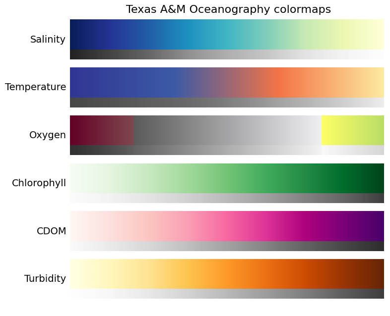 Also shown with each colormap is a grayscale version of the colormap, to demonstrate that the colormaps would be reasonably-well printed in black and white.
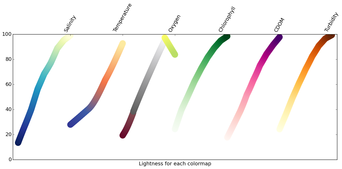
Lightness profiles of the colormaps are helpful to check out for these sequential colormaps.
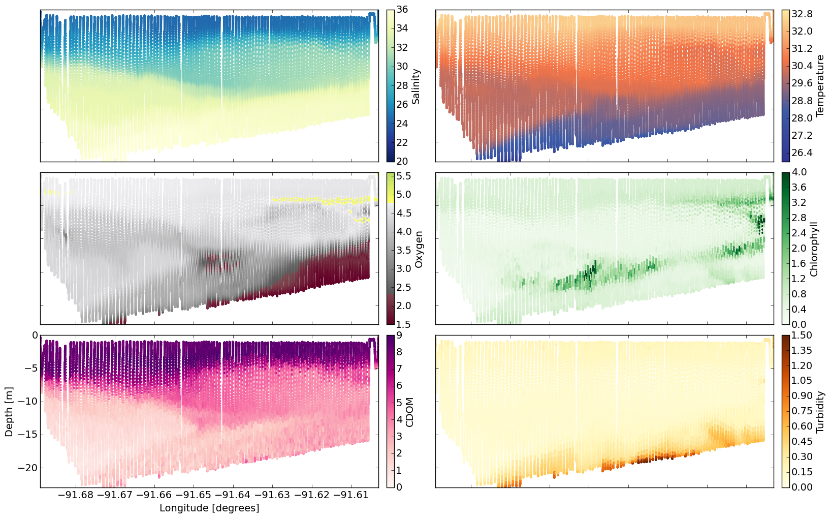
Using sample data from a hypoxia cruise, I plotted up the colormaps with actual data to show how they would look. Here I am using slightly unrealistic colorbar limits in order to demonstrate the full colorbar. The colorbars are meant to be intuitive as much as possible to the field being plotted. So, for example, the temperature colormap goes from blue-ish (cold) to red/yellow-ish (warm), but is still a sequential colormap. Or, more chlorophyll is represented by more green. The grayscale profile of oxygen is consistent, from dark to light, but has two regions of altered hue to highlight very low oxygen levels (hypoxic conditions) and super-saturated conditions (green-yellow).